Day 2
When I last wrote, Day One of our four-day mock client challenge was at an end. I was waiting to hear back from Beth and the Reputable Agency, tossing around some site structure ideas, contemplating Beth’s backstory, and considering what sort of information a person needs to know when they are hiring an electrician.
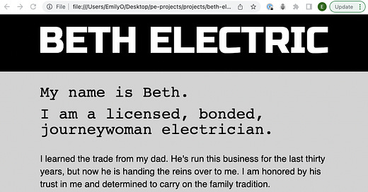
I began Day Two by putting together a first pass at a prototype site.
My initial concept for the site was fairly traditional. Beth is young, but I imagine she wants to hold on to some of the tradition of the family business and her dad’s reputation. I thought the site should convey friendliness, competence and skill, trustworthiness, family ties and knowledgeability.
That evening, I had a huddle with Ivy (aka, the Reputable Agency) - and this is when I found out that I wouldn’t be hearing from Beth at all! Part of this challenge turned out to be getting comfortable with unforthcoming clients and being able to make strong executive decisions about what information is necessary for a site, even when you don’t have much to go on. On top of that, the four-day time constraint made time management and maintaining realistic expectations big parts of the challenge, too.
Ivy encouraged me to rethink what the client actually needed. Does she really need multiple pages? What is user-friendly? What is the most important stuff? What are the bare bones of the information that must be conveyed?
This was all very illuminating. I wrote a list of the essentials:
Beth is a qualified electrician.
She does residential and commercial work.
She has roots in the trade.
She is licensed, bonded and insured.
She is upfront about her pricing and will give you a free quote.
Her contact information is readily available - she is reachable by phone or email.
Time for take two!
Day 3
On the morning of Day Three, I worked on a new site prototype, which turned out to be a real departure from where I had started. I sketched it all out on paper first and then started coding in Sublime Text.
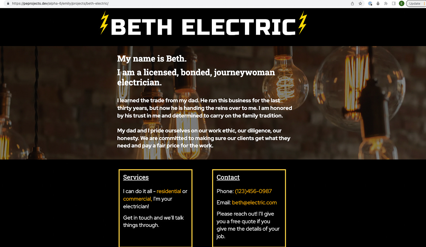
I tried out a few different fonts for the header, but landed on Russo One - I liked the boldness of it, and it felt sort of mechanical and electronic to me.
I thought about using stock photos of fathers and daughters, or of “lady electricians,” but I couldn’t get myself past the cheese factor of this. I ended up finding a simple background image of lightbulbs, which felt to the point but still subtle. I added that to the site in the afternoon and started to feel like everything was coming together.
Adventures in layout
I wrestled with the layout of the boxes for a while, and cheered out loud when I figured out how to get the “Services” heading to stay in the upper left-hand corner of its box. Initially, I had the two boxes each inside their own <section> in the HTML, all within an <inner-column> custom element. In this setup, though, I couldn’t get the boxes to be the same height unless I messed around with the padding of the “Services” box, which adjusted the height but also pushed the text down. This looked pretty weird.
I eventually hit on the idea to put each box in a <div> with the class “box-position.” If I gave each of these divs a position of “relative” and then gave the “Services” <h3> a position of “absolute,” adjusting the position of the top and the left side of the element - it stuck in place! Exactly where I wanted it! It was honestly one of the most exciting things that happened to me last week.
And about five minutes later, I looked at the CodePen Derek made to give us an intro to flexbox - so I deleted all of that code anyway and switched to flex! At which point all of my layout issues evaporated.
I added the lightning bolts with CSS pseudo-elements using ::before and ::after, and made the header and the lightning bolts change color when you hover over them. As Drew pointed out later, though, the bolts were not aligned vertically with “Beth Electric,” which bothered him. I tried to convince myself that it didn’t bother me, but I was lying to myself. This is another problem I solved with flexbox a couple days later - in the final version, the lightning bolts are image elements on either side of the main heading.
Initial feedback from my classmates told me that the yellow I had chosen for the box borders might be too jarring for some people. I ended up switching from bright yellow to the softer gold and rounded out the edges with the border-radius property. The phone number and the email address were originally the same color even though only the email address was a working link - I made the phone number a working link too after I heard that some people were compelled to fruitlessly click on the phone number. “Residential” and “commercial” presented the same problem in the “Services” box, so I ended up just changing those back to white to avoid unnecessary confusion.
Small screen considerations
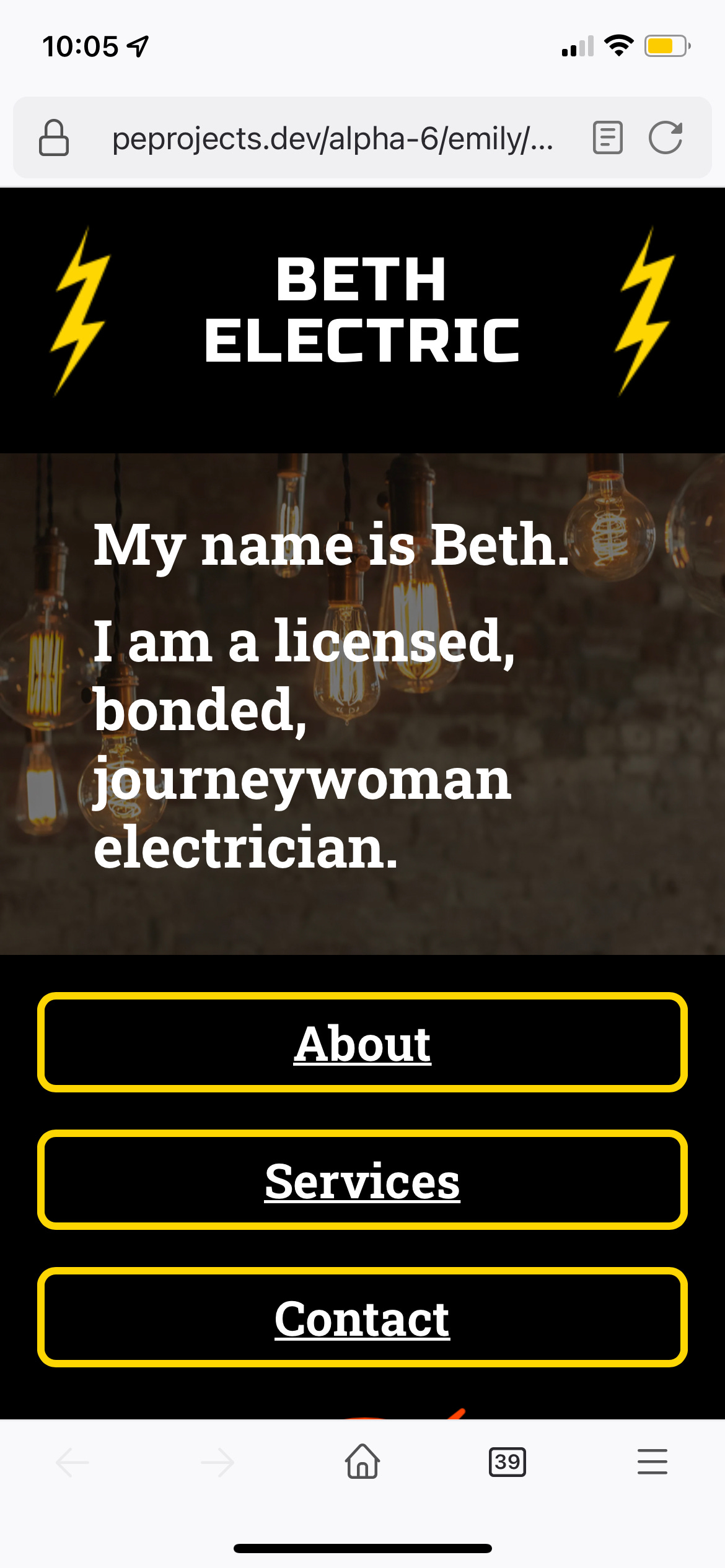
By the end of Day 3, I knew that I needed to spend some time thinking about the mobile version of the site. It was responsive, but the shrunken version of the desktop site seemed to me to be a little text-heavy on the phone. I started to consider ways to make the mobile version easier on the eyes and more readable.
In retrospect, this is one of the first things I should have done! It makes more sense for us to build for mobile first - most people are accessing the internet on their phones, and it is better to start from a place of thoughtful design and development for a small screen rather than trying to retrofit a site that was built for a desktop monitor.
I thought I wanted to make the “Services” and “Contact” boxes collapsible sections so that you wouldn’t have to scroll too far down the page to get to the relevant information - but I wasn’t really sure how to go about this. On the morning of Day 4, the last day of the challenge, I had a really helpful chat with Derek. He reminded me about the <details> element, which allowed me to do exactly what I wanted to do.
Reflections on the challenge
I woke up on Saturday morning wondering if I was making a big mistake with my design. I had moved away from the traditional feel of the first prototype and just sort of ran with my black and yellow theme. I liked it, but was it good for the client?
I mean, Beth Electric won’t return my calls, so I don’t really know!
But I think, were I to do this again, I would do more user testing and try to keep a sharper focus on the client’s goals. I would ask people what they need from an electrician’s website when they’re trying to decide who to hire. Beth, my client, needed a web presence - her first website, something that would hopefully expand her pool of customers. Would this site do that?
In any event, here it is - Beth Electric.
(Yesterday I switched the colors of the main heading and the lightning bolts - I can’t decide which way I prefer! White heading or gold? Opinions welcome!)


WOW!!! What an amazing job you have done, Beth. You have learned so much in such a short period of time. Your explanation of how you stumbled, reassessed, and were able to find the solutions to make the site happen, shows that you are becoming confident in yourself and your skills. Being able to talk the talk with a prospective employer will give him confidence that you have experience and know how to problem solve. You are going to be ahead of the game because you can explain what you are doing and why. Excellent! K